
Summary: A screen reader conveys the screen’s content by verbalizing information. Follow Material’s guidance for implementing accessible UX, which will help you label elements, assign ARIA roles, and other actions that will help your product work with screen readers.
Overview
A screen reader is software at the operating system level that conveys the screen’s content by verbalizing information in the UI or by communicating via braille. People who are blind or have low vision may benefit from screen readers as a primary means to experience a UI.
All screen readers support a variety of input and output methods, including keyboard, speech control, touchscreen gestures, dedicated braille keyboards, and more.
Main functions
A screen reader can convey elements like hierarchy, text, buttons, and images.
By default, a screen reader conveys:
- Any UI text
- An element's role (web) or control type (mobile)
- An element's state (e.g. whether a checkbox is checked)
To create parity with the visible UI, ensure that anyone using a screen reader can:
- Efficiently navigate a screen and control focus. Users should be able to navigate without being hindered by too many steps
- Receive informative but concise accessibility descriptions for all elements. Users should receive important information contained in the UI and imagery without being slowed down by long or unnecessary labels
Try a mobile screen reader
Some operating systems have built-in screen readers, such as TalkBack on Android and VoiceOver on iOS. If you design for both Android and iOS, try out Talkback and VoiceOver to understand the experience.
P4A's best practices for screen reader accessibility
In addition to Material Design guidance, Products for All Accessibility recommends keeping these best practices in mind.
Select the proper control type
Designers should work with engineering to choose the correct control type for an element since this information will be automatically read by a screen reader.
Users bring expectations for an interaction often based on its control type. For example, if you assign the control type button for a sign in affordance, users might expect to remain on the same page. If you assign the control type as link, users might expect to go to a new page. Learn more about Android controls and iOS controls.
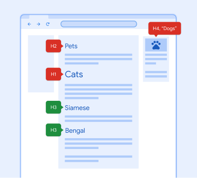
Avoid inconsistent element labels
Using different labels for the same element will confuse a user who doesn't see the screen. Instead, apply labels for the same element consistently across your product.
An example of platform differences that should be considered is where Android uses Navigate up while iOS uses Back to label back arrow icons in the navigation.
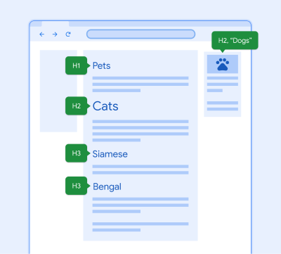
Add invisible headings to complete the hierarchy
A person who uses a screen reader might miss important information that's communicated visually and via layout, like when something is presented very large.
You can use invisible headings to "silently" identify a section of content, even if there isn't an onscreen title. Screen reader navigation can be aided by these headings.
Writing for screen readers
To learn how to write accessibility labels and alt-text for screen readers, follow the best practices in Material Design.
Learn about accessible writing
Screen reader FAQs
Can I change the focus order?
No. Although it's tempting to help a user "skip" to a critical action, don't change the focus order on mobile. The reading order should mirror the visual order of the navigation and controls on a page.
It's best to leave the order logic to the assistive technology and follow platform guidelines in GAR. Try moving a CTA higher in the hierarchy or try a skip link on web.
Should I label all components?
Tailor your design to your user and their needs but don’t reinvent common components and patterns. Visit the accessibility UX specs for more label patterns for each component at: go/a11y-ux-specs.
How do I know what a screen reader will say?
You can check out any implemented design on your phone or computer with a screenreader. To anticipate component labels, go/screenreadersays is a great guide.
What if a design has repeating elements or actions? Will it be too verbose for users of screen readers?
Collect repeated actionable elements into accessibility actions. This fixes the issue of the duplicated element and makes traversal easier and faster for users of assistive technologies. Actions help reduce the number of swipes and taps.
Accessibility actions are available under the local context menu in Android and are referred to as custom Actions in iOS. Learn more about iOS custom actions in Apple's support documentation, Making Apps More Accessible With Custom Actions.