Keyboard best practices
Summary: Keyboards enable a wide range of assistive technologies including
screen readers to operate webpages. Follow our best practices and review
Material’s guidance for keyboard accessibility.
Overview
Keyboard accessibility doesn't require specialized equipment or software because
keyboard support is built into semantic HTML. As mentioned in
Material's Flow: Focus & key traversal section, you'll want to
define the focus order, apply efficient navigation methods, and use consistent
interaction patterns.
Challenges
There are a number of issues in website accessibility today that can be tiresome
and inefficient for keyboard users.
- Many websites can't be navigated by keyboard input alone
- Some websites may hide the keyboard focus indicator
- It can be difficult to skip content and navigate without the use of several
keyboard commands
P4A's best practices for keyboard accessibility
In addition to Material Design guidance, Products for All Accessibility recommends
keeping these best practices in mind.
Localize initial focus and tab order
The keyboard navigation for right-to-left languages and locales is localized.
This means that for scripts in locales that read right-to-left, keyboard navigation
will begin in the upper right corner and end down at the bottom left to match
the right-to-left DOM order.
Customize initial focus only when necessary
In some cases, it can be more efficient for the user if initial focus is set on
an interactive element within the tab order. This should only be done if there's
a clear primary user goal that supports starting at some interactive entry
point in a critical user journey.
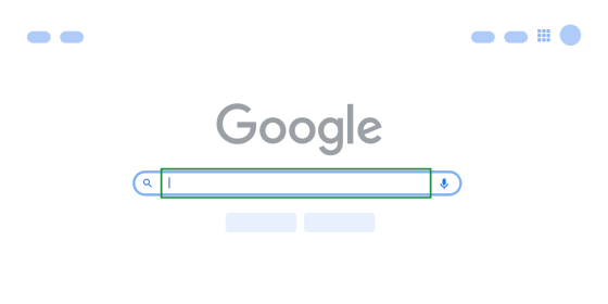 In the case of Google.com, initial keyboard focus starts in the search bar
because it's the starting point for the primary user journey and creates a
more efficient navigation experience for keyboards.
In the case of Google.com, initial keyboard focus starts in the search bar
because it's the starting point for the primary user journey and creates a
more efficient navigation experience for keyboards.
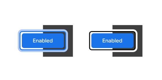
Ensure focus remains visible
A focus indicator is generally depicted as a border around
the interactive element that has focus.
Browser default focus indicators typically meet minimum
accessibility
requirements. You can explore design recommendations for custom focus indicators,
but be sure to not make them less perceivable than the defaults.
 A focus indicator is generally depicted as a border around the interactive
element that has focus.
A focus indicator is generally depicted as a border around the interactive
element that has focus.
Assign focus only to active, interactive elements
Only interactive content should be keyboard accessible. Static text like
headings and paragraphs shouldn't be assigned focus, because screen readers
have this functionality built-in.
Elements that can't be activated or aren’t actionable to mouse or touch
input should not be focusable by the keyboard. Including non-interactive
elements in the keyboard focus order causes confusion and hinders a user's
efficiency.
 Keyboard focus should only move to active interactive elements
in the tab order.
Keyboard focus should only move to active interactive elements
in the tab order.
Ensure focus remains visible
Ensure that all elements can be reached and operated through the keyboard
(GAR Web 1.2), and that focus for these elements follows a logical and
predictable order (GAR Web 1.3). Work with engineering partners to ensure
that the product's Document Object Model (DOM) is set up correctly to reflect
these logical UI reading and tab orders.
Learn more on GAR Web 1.8
 Keyboard focus should only move to active interactive elements in the tab order.
Annotate the navigation flow (tab order) of the web page to ensure it follows
the logical and linear reading order of the page.
Provide "skip navigation" links
A “skip navigation” link at the top of a page moves users down to the
main content for faster and simpler access to information. This allows people
to bypass long lists of interactive elements, such as a
large multi-layered menu
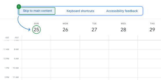 Provide a "Skip to" link that allows users to reach important content
faster.
Provide a "Skip to" link that allows users to reach important content
faster.
Keyboard FAQs
What’s the standard keyboard behavior for a specific component?
Many common components have standard keyboard patterns already defined. Designers
should refer to sources like the ARIA Authoring Practices Guide (APG)
to find the component library that their product uses and review the behavior
documentation.
Can the default navigation or tab order be customized?
Modifying the existing tab order is discouraged as it diverges from the existing
visual order, or DOM order.
Can keyboard shortcuts be used to make the keyboard experience more accessible?
It’s best to ensure that your feature can work with the standard primary keys
first. A shortcut shouldn’t be the only way of interacting with something. If
an experience involves a keyboard shortcut, try to make it as discoverable
as possible.
Should elements in disabled (also known as inoperable) states receive focus?
Avoid adding interactive elements to disabled states as this conflicts with users'
mental model of when they can interact with a control. When there is a disabled
element, it's recommended that there is helpful information for the user.
This can be nearby text.
If the disabled element has additional information on
hover or focus, it's recommended to have a separate info icon button that is
interactive. This info icon button should utilize modals (dialogs or rich
tooltips) for accessible interactivity.
Except as otherwise noted, the content of this page is licensed under the Creative Commons Attribution 4.0 License, and code samples are licensed under the Apache 2.0 License. For details, see the Google Developers Site Policies. Java is a registered trademark of Oracle and/or its affiliates.
Last updated 2024-04-03 UTC.
